Context
Beat is a ride-hailing app competing with Uber, Cabify & Didi for the mobility market in Latin America. During 2021, one of Beat’s priorities was to increase the availability of its drivers so that there would be no passengers left unserved. In order to do so, we had to explore ways to entice drivers to spend more time driving with Beat than other apps.
My role
As a Senior Product Designer, I was responsible for defining the problem statement, designing the solutions and validating our hypotheses to accomplish the business and users’ objectives.
Problem statement
How might we increase drivers’ availability so that passengers can find a ride faster, without increasing Beat’s acquisition or retention costs?


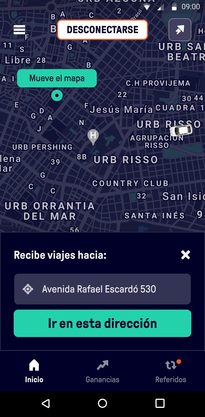
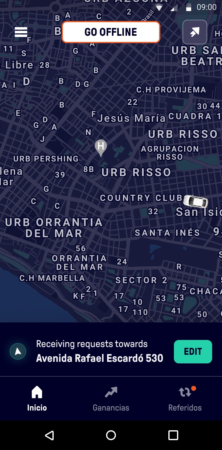
👆 In the image above
Some screenshots in the flow of the Minimum Viable Product launched in late 2021 for all Beat drivers in Perú, Colombia, Argentina, Chile & México.
In a nutshell, things I did:
Analysed existing evidence (surveys, app reviews, driver comments on conversations with customer service) to understand the problem better.
Initiated and facilitated ideation workshops and brainstorms.
Collaborated with the Product Manager, researcher, engineers and data analysts to define a clear, testable hypothesis.
Created a script with the researcher for an unmoderated user interview through the platform Videoask.
Created different low-fidelity solutions with my team and decided which one might have the biggest impact by revising the existing evidence.
Created prototypes on Figma and tested them through moderated usability tests. Refined the prototype based on user feedback.
Collaborated with engineers to facilitate the implementation of the feature.
Launched the feature in a controlled experiment that was made available only in a specific market (Colombia) for a percentage of our drivers.
Measured the results and improved the feature by prioritising changes based on qualitative and quantitative evidence.
Presented the project in the different Beat product offices, for example during a business trip in the Bogotá office.
Understanding the problem.
As a product designer, following a solid, stablished process is key to increase impact. In the past few years I’ve followed religiously the double diamond framework for its flexibility and similarity to other processes I like, such as the scientific method.
Quarterly satisfaction surveys that were sent to drivers by the customer insights team in each one of the Latin American markets. This helped us know what things mattered most to drivers, and how could we make them use Beat over other apps.
User interviews that were part of other projects but also included some information that was very useful to define our problem statement. For example: some user interviews were done around the commission topic: in those interviews, we learned that because of Beat’s lower commission for drivers, they would rather use certain features with us than with competitors.
App reviews: although much less empiric, app reviews helped us get a glance of what drivers hated or were missing in our app.
Defining the problem.
It was pretty clear from the existing evidence + the new interviews we did that one feature that drivers’ desperately needed the so called “Destination Filter” – which was already available in most competitors’ apps. This feature allowed them to end their working day by setting home as their destination and getting rides along the way – while earning money.
After talking to the engineers and product managers from other areas of the business, we agreed that this feature could be among the most impactful ones to implement while keeping the complexity low.
I wrote, together with the Product Manager, a clear hypothesis that could be tested later on in an A/B test.
Hypothesis
Based on user research (interviews, surveys and others), we believe that by introducing a feature that allows drivers to choose a destination to driver towards, they will stay more time in the Beat app instead of switching to competitors, resulting in an increase of availability for Beat and an increase of customer satisfaction for both drivers and passengers. We will know this when we see an increase in the metric “Driver Availability” in our A/B testing platform.
Ideating solutions.
Now that we converged into a clearly defined hypothesis, it was the moment for creating several low-fidelity solutions that might solve the problem.
As the Sr. Designer in the team, I worked on some mockups on Figma, got feedback from the design team in my department (2 other UX designers) and presented ideas in the design feedback session to create this feature collaboratively and remove my own biases.
We decided to go with a solution called Destination Filter: a feature that allowed a driver to enter a destination and receive rides towards that destination, as opposed to receiving rides to any place. We prioritized this feature over others because:
Research showed that drivers needed a way of going to a specific place (home or work, mostly) and not just accept any ride request.
Competitor analysis demonstrated that drivers would switch to a different app when wanting to go home, because we didn’t have this feature. This resulted in drivers working only a percentage of their day with us.
Given the abundance of evidence we had, this was one of the least risky and highest return-on-investment features we could work on.
In the images above
High-fidelity screens of the first version of the feature launched. I followed the existing design system components and created a couple of new ones to match the needs of this specific feature.
Delivering & measuring.
Once we were happy with the MVP of the feature, I worked with my Product Manager & engineers to refine it and make it less complex for the implementation phase.
We (data analyst, product manager and me) decided on the primary metric & secondary metrics for our experiment, while the feature was implemented.
A few sprints later, the feature was implemented and ready to be tested in Colombia with a percentage of our iOS users. By introducing it progressively, we decreased the impact of possible bugs and other problems. We collected some quick feedback from the first adopters and increased the users that were exposed to the feature once we were happy with its state.
After a few weeks of the experiment running in our Colombian market (which was our second strongest market, with thousands of drivers active every day), we measured the results – which conclusively increased the driver availability!

In the images above
Results of implementing the feature in our in-house experiment platform. Please bear in mind that the numbers are for illustrative purposes only.
Conclusions
I chose this project to show my process and experience as an individual contributor in an international, distributed product company. I think it paints a clear picture of how I work within a team, collaborate with other roles, follow a structured process and rely on empirical evidence to make design decisions.
Thanks for taking a look!
– Alejandro.
Managing a Design team at Beat
How I contributed as a design manager to a distributed team that enabled safe and reliable mobility
in Latin America.


